
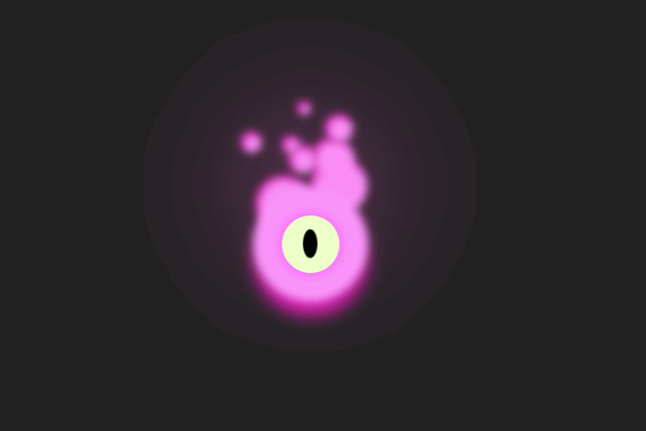
这段 HTML 和 CSS 代码是一个简单的网页卡片设计,用于展示一个带有动画效果的宇航员卡片
演示效果


HTML&CSS
<!DOCTYPE html>
<html lang="en">

<head>
    <meta charset="UTF-8">
    <meta name="viewport" content="width=device-width, initial-scale=1.0">
    <title>前端Hardy</title>
    <style>
        body {
            background-color: #212121;
            color: #fff;
            font-family: 'Indie Flower', cursive;
            display: flex;
            justify-content: center;
            align-items: center;
            flex-direction: column;
            height: 100vh;
        }

        .card {
            position: relative;
            width: 19em;
            height: 25em;
            display: flex;
            flex-direction: column;
            align-items: center;
            justify-content: center;
            background-color: #171717;
            color: white;
            font-family: Montserrat;
            font-weight: bold;
            padding: 1em 2em 1em 1em;
            border-radius: 20px;
            overflow: hidden;
            z-index: 1;
            row-gap: 1em;
        }

        .card img {
            width: 12em;
            margin-right: 1em;
            animation: move 10s ease-in-out infinite;
            z-index: 5;
        }

        .image:hover {
            cursor: -webkit-grab;
            cursor: grab;
        }


        .card::before {
            content: "";
            position: absolute;
            width: 100%;
            height: 100%;
            inset: -3px;
            border-radius: 10px;
            background: radial-gradient(#858585, transparent, transparent);
            transform: translate(-5px, 250px);
            transition: 0.4s ease-in-out;
            z-index: -1;
        }

        .card:hover::before {
            width: 150%;
            height: 100%;
            margin-left: -4.25em;
        }

        .card::after {
            content: "";
            position: absolute;
            inset: 2px;
            border-radius: 20px;
            background: rgb(23, 23, 23, 0.7);
            transition: all 0.4s ease-in-out;
            z-index: -1;
        }

        .heading {
            z-index: 2;
            transition: 0.4s ease-in-out;
        }

        .card:hover .heading {
            letter-spacing: 0.025em;
        }

        .heading::before {
            content: "";
            position: absolute;
            top: 0;
            left: 0;
            width: 2px;
            height: 2px;
            border-radius: 50%;
            opacity: 1;
            box-shadow: 220px 118px #fff, 280px 176px #fff, 40px 50px #fff,
                60px 180px #fff, 120px 130px #fff, 180px 176px #fff, 220px 290px #fff,
                520px 250px #fff, 400px 220px #fff, 50px 350px #fff, 10px 230px #fff;
            z-index: -1;
            transition: 1s ease;
            animation: 1s glowing-stars linear alternate infinite;
            animation-delay: 0s;
        }

        .image:active {
            cursor: -webkit-grabbing;
            cursor: grabbing;
        }

        .image:active+.heading::before {
            box-shadow: 240px 20px #9b40fc, 240px 25px #9b40fc, 240px 30px #9b40fc,
                240px 35px #9b40fc, 240px 40px #9b40fc, 242px 45px #9b40fc,
                246px 48px #9b40fc, 251px 49px #9b40fc, 256px 48px #9b40fc,
                260px 45px #9b40fc, 262px 40px #9b40fc;
            animation: none;
            filter: blur(0);
            border-radius: 2px;
            width: 0.45em;
            height: 0.45em;
            scale: 0.65;
            transform: translateX(9em) translateY(1em);
        }


        .heading::after {
            content: "";
            top: -8.5%;
            left: -8.5%;
            position: absolute;
            width: 7.5em;
            height: 7.5em;
            border: none;
            outline: none;
            border-radius: 50%;
            background: #f9f9fb;
            box-shadow: 0px 0px 100px rgba(193, 119, 241, 0.8),
                0px 0px 100px rgba(135, 42, 211, 0.8), inset #9b40fc 0px 0px 40px -12px;
            transition: 0.4s ease-in-out;
            z-index: -1;
        }

        .card:hover .heading::after {
            box-shadow: 0px 0px 200px rgba(193, 119, 241, 1),
                0px 0px 200px rgba(135, 42, 211, 1), inset #9b40fc 0px 0px 40px -12px;
        }


        .instagram,
        .x,
        .discord {
            position: relative;
            transition: 0.4s ease-in-out;
        }

        .instagram:after,
        .x:after,
        .discord:after {
            content: "";
            position: absolute;
            width: 0.5em;
            height: 0.5em;
            left: 0;
            background-color: white;
            box-shadow: 0px 0px 10px rgba(233, 233, 233, 0.5),
                0px 0px 10px rgba(192, 192, 192, 0.5);
            border-radius: 50%;
            z-index: -1;
            transition: 0.3s ease-in-out;
        }

        .instagram svg path,
        .x svg path,
        .discord svg path {
            stroke: #808080;
            transition: 0.4s ease-in-out;
        }

        .instagram:hover svg path {
            stroke: #cc39a4;
        }

        .x:hover svg path {
            stroke: black;
        }

        .discord:hover svg path {
            stroke: #8c9eff;
        }

        .instagram svg,
        .x svg,
        .discord svg {
            transition: 0.3s ease-in-out;
        }

        .instagram:hover svg {
            scale: 1.4;
        }

        .x:hover svg,
        .discord:hover svg {
            scale: 1.25;
        }

        .instagram:hover:after,
        .x:hover:after,
        .discord:hover:after {
            scale: 4;
            transform: translateX(0.09em) translateY(0.09em);
        }

        .instagram::before {
            content: "";
            position: absolute;
            top: -700%;
            left: 1050%;
            rotate: -45deg;
            width: 5em;
            height: 1px;
            background: linear-gradient(90deg, #ffffff, transparent);
            animation: 4s shootingStar ease-in-out infinite;
            transition: 1s ease;
            animation-delay: 1s;
        }

        .x::before {
            content: "";
            position: absolute;
            top: -1300%;
            left: 850%;
            rotate: -45deg;
            width: 5em;
            height: 1px;
            background: linear-gradient(90deg, #ffffff, transparent);
            animation: 4s shootingStar ease-in-out infinite;
            animation-delay: 3s;
        }

        .discord::before {
            content: "";
            position: absolute;
            top: -2100%;
            left: 850%;
            rotate: -45deg;
            width: 5em;
            height: 1px;
            background: linear-gradient(90deg, #ffffff, transparent);
            animation: 4s shootingStar ease-in-out infinite;
            animation-delay: 5s;
        }

        .card:hover .instagram::before,
        .card:hover .x::before,
        .card:hover .discord::before {
            filter: blur(3px);
        }


        @keyframes shootingStar {
            0% {
                transform: translateX(0) translateY(0);
                opacity: 1;
            }

            50% {
                transform: translateX(-55em) translateY(0);
                opacity: 1;
            }

            70% {
                transform: translateX(-70em) translateY(0);
                opacity: 0;
            }

            100% {
                transform: translateX(0) translateY(0);
                opacity: 0;
            }
        }

        @keyframes move {
            0% {
                transform: translateX(0em) translateY(0em);
            }

            25% {
                transform: translateY(-1em) translateX(-1em);
                rotate: -10deg;
            }

            50% {
                transform: translateY(1em) translateX(-1em);
            }

            75% {
                transform: translateY(-1.25em) translateX(1em);
                rotate: 10deg;
            }

            100% {
                transform: translateX(0em) translateY(0em);
            }
        }

        @keyframes glowing-stars {
            0% {
                opacity: 0;
            }

            50% {
                opacity: 1;
            }

            100% {
                opacity: 0;
            }
        }
    </style>
</head>

<body>
    <div class="card">
        <img src="https://uiverse.io/astronaut.png" alt="" class="image" />
        <div class="heading">我是宇航员</div>
    </div>

</body>

</html>
-
card:一个类名为“card”的div元素,用于创建卡片布局。 -
image:一个图片元素,用于显示宇航员的图片。src属性指定图片的URL,alt属性提供图片的替代文本(这里为空),class属性用于应用CSS样式。 -
heading:一个类名为“heading”的div元素,包含文本“我是宇航员”。 -
.card:设置卡片的样式。position、width、height、display、flex-direction、align-items、justify-content:定位卡片,设置大小和布局。background-color、color、font-family、font-weight:设置背景颜色、文本颜色、字体和字体粗细。padding、border-radius、overflow、z-index:设置内边距、边框圆角、溢出隐藏和层叠上下文。row-gap:设置行间距。 -
.card img:设置卡片内图片的样式。width、margin-right:设置图片宽度和右边距。animation:应用动画效果。 -
.image:hover:设置鼠标悬停在图片上时的样式。 -
cursor:改变鼠标光标样式。 -
.card::before 和 .card::after:使用伪元素为卡片添加装饰效果。content、position、width、height、inset、border-radius、background、transform、transition、z-index:设置伪元素的内容、位置、大小、形状和动画效果。 -
.heading:设置标题的样式。z-index、transition:设置层叠顺序和动画效果。.heading::before 和 .heading::after:使用伪元素为标题添加装饰效果。 -
.instagram、.x、.discord:设置社交图标的样式。position、transition:定位和动画效果。&:after、&:before:使用伪元素添加装饰效果。 -
@keyframes:定义动画效果。
