
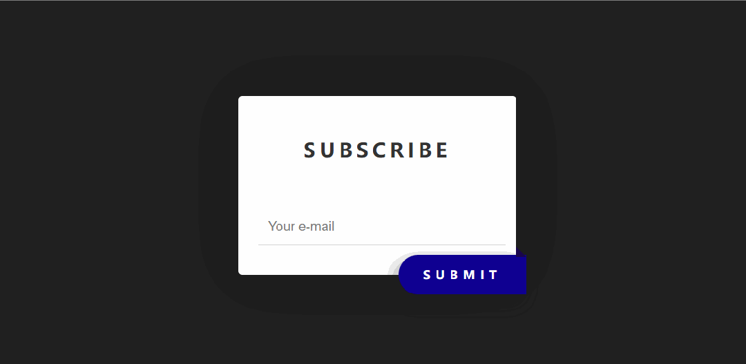
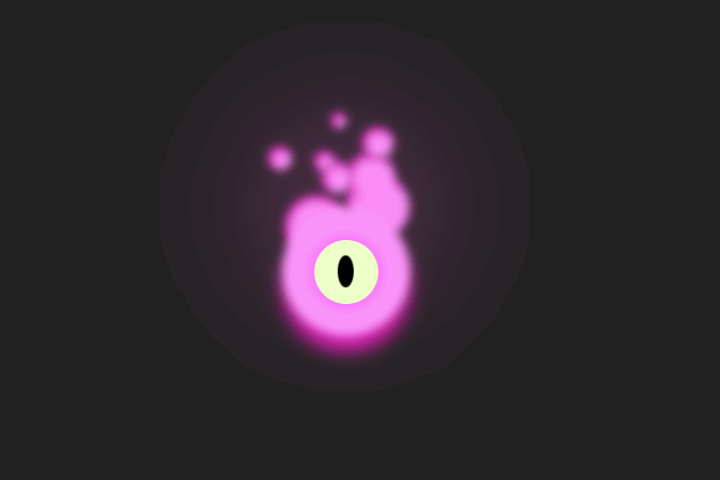
这段代码实现了一个带有动态效果的聊天机器人界面,包含输入框、操作按钮和标签区域,整体风格为深色主题,带有渐变和阴影效果。
大家复制代码时,可能会因格式转换出现错乱,导致样式失效。建议先少量复制代码进行测试,若未能解决问题,私信我,我会发送完整的压缩包给你。
演示效果

HTML&CSS
html>
html lang="en">

head>
    meta charset="UTF-8">
    meta name="viewport" content="width=device-width, initial-scale=1.0">
    title>公众号关注:前端Hardytitle>
    style>
        body {
            margin: 0;
            padding: 0;
            background: #212121;
            display: flex;
            align-items: center;
            justify-content: center;
            height: 100vh;
        }

        .container_chat_bot {
            display: flex;
            flex-direction: column;
            max-width: 260px;
            width: 100%;
        }

        .container_chat_bot .container-chat-options {
            position: relative;
            display: flex;
            background: linear-gradient(to bottom right,#7e7e7e,#363636,#363636,#363636,#363636);
            border-radius: 16px;
            padding: 1.5px;
            overflow: hidden;

            &::after {
                position: absolute;
                content: "";
                top: -10px;
                left: -10px;
                background: radial-gradient(ellipse at center, #ffffff,  rgba(255, 255, 255, 0.3),  rgba(255, 255, 255, 0.1),  rgba(0, 0, 0, 0),  rgba(0, 0, 0, 0),  rgba(0, 0, 0, 0),  rgba(0, 0, 0, 0));
                width: 30px;
                height: 30px;
                filter: blur(1px);
            }
        }

        .container_chat_bot .container-chat-options .chat {
            display: flex;
            flex-direction: column;
            background-color: rgba(0, 0, 0, 0.5);
            border-radius: 15px;
            width: 100%;
            overflow: hidden;
        }

        .container_chat_bot .container-chat-options .chat .chat-bot {
            position: relative;
            display: flex;
        }

        .container_chat_bot .chat .chat-bot textarea {
            background-color: transparent;
            border-radius: 16px;
            border: none;
            width: 100%;
            height: 50px;
            color: #ffffff;
            font-family: sans-serif;
            font-size: 12px;
            font-weight: 400;
            padding: 10px;
            resize: none;
            outline: none;

            &::-webkit-scrollbar {
                width: 10px;
                height: 10px;
            }

            &::-webkit-scrollbar-track {
                background: transparent;
            }

            &::-webkit-scrollbar-thumb {
                background: #888;
                border-radius: 5px;
            }

            &::-webkit-scrollbar-thumb:hover {
                background: #555;
                cursor: pointer;
            }

            &::placeholder {
                color: #f3f6fd;
                transition: all 0.3s ease;
            }

            &:focus::placeholder {
                color: #363636;
            }
        }

        .container_chat_bot .chat .options {
            display: flex;
            justify-content: space-between;
            align-items: flex-end;
            padding: 10px;
        }

        .container_chat_bot .chat .options .btns-add {
            display: flex;
            gap: 8px;

            & button {
                display: flex;
                color: rgba(255, 255, 255, 0.6);
                background-color: transparent;
                border: none;
                cursor: pointer;
                transition: all 0.3s ease;

                &:hover {
                    transform: translateY(-5px);
                    color: #ffffff;
                }
            }
        }

        .container_chat_bot .chat .options .btn-submit {
            display: flex;
            padding: 2px;
            background-image: linear-gradient(to top, #292929, #555555, #292929);
            border-radius: 10px;
            box-shadow: inset 0 6px 2px -4px rgba(255, 255, 255, 0.5);
            cursor: pointer;
            border: none;
            outline: none;
            transition: all 0.15s ease;

            & i {
                width: 30px;
                height: 30px;
                padding: 6px;
                background: rgba(0, 0, 0, 0.1);
                border-radius: 10px;
                backdrop-filter: blur(3px);
                color: #8b8b8b;
            }

            & svg {
                transition: all 0.3s ease;
            }

            &:hover svg {
                color: #f3f6fd;
                filter: drop-shadow(0 0 5px #ffffff);
            }

            &:focus svg {
                color: #f3f6fd;
                filter: drop-shadow(0 0 5px #ffffff);
                transform: scale(1.2) rotate(45deg) translateX(-2px) translateY(1px);
            }

            &:active {
                transform: scale(0.92);
            }
        }

        .container_chat_bot .tags {
            padding: 14px 0;
            display: flex;
            color: #ffffff;
            font-size: 10px;
            gap: 4px;

            & span {
                padding: 4px 8px;
                background-color: #1b1b1b;
                border: 1.5px solid #363636;
                border-radius: 10px;
                cursor: pointer;
                user-select: none;
            }
        }
    style>
head>

body>
    div class="container_chat_bot">
        div class="container-chat-options">
            div class="chat">
                div class="chat-bot">
                    textarea id="chat_bot" name="chat_bot" placeholder="Imagine Something...✦˚">textarea>
                div>
                div class="options">
                    div class="btns-add">
                        button>
                            svg xmlns="http://www.w3.org/2000/svg" width="20" height="20" viewBox="0 0 24 24">
                                path fill="none" stroke="currentColor" stroke-linecap="round" stroke-linejoin="round"
                                    stroke-width="2" d="M7 8v8a5 5 0 1 0 10 0V6.5a3.5 3.5 0 1 0-7 0V15a2 2 0 0 0 4 0V8">
                                path>
                            svg>
                        button>
                        button>
                            svg viewBox="0 0 24 24" height="20" width="20" xmlns="http://www.w3.org/2000/svg">
                                path
                                    d="M4 5a1 1 0 0 1 1-1h4a1 1 0 0 1 1 1v4a1 1 0 0 1-1 1H5a1 1 0 0 1-1-1zm0 10a1 1 0 0 1 1-1h4a1 1 0 0 1 1 1v4a1 1 0 0 1-1 1H5a1 1 0 0 1-1-1zm10 0a1 1 0 0 1 1-1h4a1 1 0 0 1 1 1v4a1 1 0 0 1-1 1h-4a1 1 0 0 1-1-1zm0-8h6m-3-3v6"
                                    stroke-width="2" stroke-linejoin="round" stroke-linecap="round"
                                    stroke="currentColor" fill="none">path>
                            svg>
                        button>
                        button>
                            svg viewBox="0 0 24 24" height="20" width="20" xmlns="http://www.w3.org/2000/svg">
                                path
                                    d="M12 22C6.477 22 2 17.523 2 12S6.477 2 12 2s10 4.477 10 10s-4.477 10-10 10m-2.29-2.333A17.9 17.9 0 0 1 8.027 13H4.062a8.01 8.01 0 0 0 5.648 6.667M10.03 13c.151 2.439.848 4.73 1.97 6.752A15.9 15.9 0 0 0 13.97 13zm9.908 0h-3.965a17.9 17.9 0 0 1-1.683 6.667A8.01 8.01 0 0 0 19.938 13M4.062 11h3.965A17.9 17.9 0 0 1 9.71 4.333A8.01 8.01 0 0 0 4.062 11m5.969 0h3.938A15.9 15.9 0 0 0 12 4.248A15.9 15.9 0 0 0 10.03 11m4.259-6.667A17.9 17.9 0 0 1 15.973 11h3.965a8.01 8.01 0 0 0-5.648-6.667"
                                    fill="currentColor">path>
                            svg>
                        button>
                    div>
                    button class="btn-submit">
                        i>
                            svg viewBox="0 0 512 512">
                                path fill="currentColor"
                                    d="M473 39.05a24 24 0 0 0-25.5-5.46L47.47 185h-.08a24 24 0 0 0 1 45.16l.41.13l137.3 58.63a16 16 0 0 0 15.54-3.59L422 80a7.07 7.07 0 0 1 10 10L226.66 310.26a16 16 0 0 0-3.59 15.54l58.65 137.38c.06.2.12.38.19.57c3.2 9.27 11.3 15.81 21.09 16.25h1a24.63 24.63 0 0 0 23-15.46L478.39 64.62A24 24 0 0 0 473 39.05">
                                path>
                            svg>
                        i>
                    button>
                div>
            div>
        div>
        div class="tags">
            span>Create An Imagespan>
            span>Analyse Dataspan>
            span>Morespan>
        div>
    div>
body>

html>
HTML 结构
-
container_chat_bot:整个聊天机器人的容器,包含聊天框和标签。 -
container-chat-options:聊天框的容器,包含背景和装饰效果。 -
chat:聊天框的主体部分,包含输入框和操作按钮。 -
chat-bot:聊天框的输入区域。 -
textarea:用户输入内容的文本框。 -
options:聊天框的操作区域,包含按钮。 -
btns-add:包含附加功能按钮的容器。 -
button:操作按钮,如添加功能按钮和提交按钮。 -
tags:显示标签的区域,包含多个标签。
CSS 样式
-
body:设置页面背景颜色、布局方式(居中对齐)和全屏高度。 -
.container_chat_bot:定义聊天机器人容器的布局方式和最大宽度。 -
.container-chat-options:定义聊天框的背景渐变、圆角和阴影效果,包含顶部装饰性渐变圆圈。 -
.chat:定义聊天框主体的背景颜色和圆角。 -
.chat-bot textarea:定义输入框的样式,包括透明背景、字体颜色、滚动条样式和占位符效果。 -
.options:定义操作区域的布局方式。 -
.btns-add button:定义附加功能按钮的样式,包括图标、悬停效果和动画。 -
.btn-submit:定义提交按钮的样式,包括背景渐变、阴影、悬停效果和点击动画。 -
.tags:定义标签区域的样式,包括字体颜色、背景颜色和间距。 -
.tags span:定义单个标签的样式,包括背景颜色、边框和圆角。
各位互联网搭子,要是这篇文章成功引起了你的注意,别犹豫,关注、点赞、评论、分享走一波,让我们把这份默契延续下去,一起在知识的海洋里乘风破浪!
