
<!DOCTYPE html>
<html lang="en">

<head>
    <meta charset="UTF-8">
    <meta name="viewport" content="width=device-width, initial-scale=1.0">
    <title>公众号关注:前端Hardy</title>
    <style>
        body {
            margin: 0;
            padding: 0;
            height: 100vh;
            display: flex;
            align-items: center;
            justify-content: center;
            position: relative;
            background: #212121;
        }

        @property --modif {
            syntax: '<number>';
            inherits: false;
            initial-value: 1;
        }

        @property --transY {
            syntax: '<length>';
            inherits: false;
            initial-value: 0px;
        }

        .sunbox {
            font-size: 1vmin;
            position: absolute;
            top: 50%;
            left: 50%;
            transform: translate(-50%, -50%);
            width: 50em;
            aspect-ratio: 1;
            overflow: hidden;

            .center {
                position: absolute;
                top: 50%;
                left: 50%;
                width: 25em;
                transform: translate(-50%, -50%);
                aspect-ratio: 1;
                background: #fc0;
                border-radius: 50% 48% 47% 52%;
                animation:
                    rotate 5s infinite,
                    shake 4.7s infinite;

                .cheek {
                    --pos: 30%;
                    width: 11%;
                    aspect-ratio: 1.5;
                    border-radius: 50%;
                    background: #f003;
                    position: absolute;
                    transform: translate(-50%, -50%);
                    top: 67%;
                    left: var(--pos);

                    &+& {
                        left: calc(100% - var(--pos));
                    }
                }

                .eye {
                    --pos: 35%;
                    width: 11%;
                    aspect-ratio: 1;
                    border-radius: 50%;
                    background: #000;
                    position: absolute;
                    transform: translate(-50%, -50%);
                    top: 60%;
                    left: var(--pos);

                    &::before {
                        content: "";
                        position: absolute;
                        top: 30%;
                        left: 35%;
                        width: 30%;
                        aspect-ratio: 1;
                        border-radius: 50%;
                        transform: translate(-50%, -50%);
                        background: #fff;
                        animation: growShrink 3s linear infinite;
                    }

                    &::after {
                        content: "";
                        position: absolute;
                        top: 50%;
                        left: 15%;
                        width: 20%;
                        aspect-ratio: 1;
                        border-radius: 50%;
                        transform: translate(-50%, -50%);
                        background: #fff;
                        animation: growShrink 3s -1.5s linear infinite;
                    }

                    &+& {
                        left: calc(100% - var(--pos));
                    }
                }

                .mouth {
                    --size: 0.7em;
                    width: 7%;
                    aspect-ratio: 1;
                    border: var(--size) solid #0000;
                    border-left-color: #000;
                    border-bottom-color: #000;
                    border-radius: 50%;
                    top: 63%;
                    left: 50%;
                    position: absolute;
                    transform: translate(-50%, -50%) rotate(-45deg);
                }
            }

            .ray {
                --angle: 0deg;
                --modif: 1;
                --transY: -13.5em;
                --anim: ;
                --extraanim: ;
                width: 3%;
                height: 10%;
                background: #fb2;
                border-radius: 50%;
                top: 50%;
                left: 50%;
                transform-origin: 50% 100%;
                transform: translate(-50%, -100%) rotate(var(--angle)) translateY(var(--transY)) scaleY(var(--modif));
                position: absolute;
                animation:
                    var(--extraanim) var(--anim);

                &:nth-child(odd) {
                    --anim: growRays 2s infinite linear;
                }

                &:nth-child(even) {
                    --anim: growRays 2s -1s infinite linear;
                }

                &:nth-child(3n) {
                    animation-delay: -1.3s;
                }

                &:nth-child(7n) {
                    animation-delay: -0.7s;
                }

                &:nth-child(4n) {
                    --extraanim: moveRay 1.6s infinite linear, ;
                }

                &:nth-child(5n) {
                    --extraanim: moveRay 2.3s -1.1s infinite linear, ;
                }
            }
        }

        @keyframes growRays {

            0%,
            100% {
                --modif: 1;
            }

            50% {
                --modif: 1.6;
            }
        }

        @keyframes shake {

            0%,
            100% {
                border-radius: 50% 48% 47% 52%;
            }

            20% {
                border-radius: 53% 50% 49% 47%;
            }

            40% {
                border-radius: 51% 47% 52% 50%;
            }

            60% {
                border-radius: 48% 51% 50% 51%;
            }

            80% {
                border-radius: 47% 50% 51% 48%;
            }
        }

        @keyframes rotate {

            0%,
            100% {
                transform: translate(-50%, -50%) rotate(0deg)
            }

            33% {
                transform: translate(-50%, -50%) rotate(2deg);
            }

            66% {
                transform: translate(-50%, -50%) rotate(-2deg);
            }
        }

        @keyframes growShrink {

            0%,
            100% {
                scale: 1.1 1.1;
            }

            50% {
                scale: 0.9 0.9;
            }
        }

        @keyframes moveRay {

            0%,
            100% {
                --transY: -13.5em;
            }

            33% {
                --transY: -13.25em;
            }

            66% {
                --transY: -13.75em;
            }
        }


        #youtube {
            z-index: 2;
            display: block;
            width: 100px;
            height: 70px;
            position: absolute;
            bottom: 20px;
            right: 20px;
            background: red;
            border-radius: 50% / 11%;
            transition: transform 0.5s;
        }

        #youtube:hover,
        #youtube:focus {
            transform: scale(1.1);
        }

        #youtube::before {
            content: "";
            display: block;
            position: absolute;
            top: 7.5%;
            left: -6%;
            width: 112%;
            height: 85%;
            background: red;
            border-radius: 9% / 50%;
        }

        #youtube::after {
            content: "";
            display: block;
            position: absolute;
            top: 20px;
            left: 40px;
            width: 45px;
            height: 30px;
            border: 15px solid transparent;
            box-sizing: border-box;
            border-left: 30px solid white;
        }

        #youtube span {
            font-size: 0;
            position: absolute;
            width: 0;
            height: 0;
            overflow: hidden;
        }
    </style>
</head>

<body>
    <div class="sunbox">
        <div class="ray" style="--angle: 0deg;"></div>
        <div class="ray" style="--angle: 10deg;"></div>
        <div class="ray" style="--angle: 20deg;"></div>
        <div class="ray" style="--angle: 30deg;"></div>
        <div class="ray" style="--angle: 40deg;"></div>
        <div class="ray" style="--angle: 50deg;"></div>
        <div class="ray" style="--angle: 60deg;"></div>
        <div class="ray" style="--angle: 70deg;"></div>
        <div class="ray" style="--angle: 80deg;"></div>
        <div class="ray" style="--angle: 90deg;"></div>
        <div class="ray" style="--angle: 100deg;"></div>
        <div class="ray" style="--angle: 110deg;"></div>
        <div class="ray" style="--angle: 120deg;"></div>
        <div class="ray" style="--angle: 130deg;"></div>
        <div class="ray" style="--angle: 140deg;"></div>
        <div class="ray" style="--angle: 150deg;"></div>
        <div class="ray" style="--angle: 160deg;"></div>
        <div class="ray" style="--angle: 170deg;"></div>
        <div class="ray" style="--angle: 180deg;"></div>
        <div class="ray" style="--angle: 190deg;"></div>
        <div class="ray" style="--angle: 200deg;"></div>
        <div class="ray" style="--angle: 210deg;"></div>
        <div class="ray" style="--angle: 220deg;"></div>
        <div class="ray" style="--angle: 230deg;"></div>
        <div class="ray" style="--angle: 240deg;"></div>
        <div class="ray" style="--angle: 250deg;"></div>
        <div class="ray" style="--angle: 260deg;"></div>
        <div class="ray" style="--angle: 270deg;"></div>
        <div class="ray" style="--angle: 280deg;"></div>
        <div class="ray" style="--angle: 290deg;"></div>
        <div class="ray" style="--angle: 300deg;"></div>
        <div class="ray" style="--angle: 310deg;"></div>
        <div class="ray" style="--angle: 320deg;"></div>
        <div class="ray" style="--angle: 330deg;"></div>
        <div class="ray" style="--angle: 340deg;"></div>
        <div class="ray" style="--angle: 350deg;"></div>
        <div class="center">
            <div class="cheek"></div>
            <div class="cheek"></div>
            <div class="eye"></div>
            <div class="eye"></div>
            <div class="mouth"></div>
        </div>
    </div>

</body>

</html>
HTML 结构
-
-
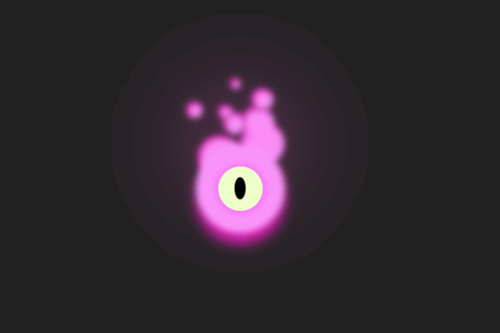
多个 ray: 创建围绕中心的光线,每个光线通过–angle 变量设置角度。
-
-
-
-
CSS 样式
-
body: 设置页面的边距、填充、高度、显示方式和对齐方式。
-
@property –modif, @property –transY: 定义 CSS 属性,用于动态调整光线的伸缩和位置。
-
sunbox: 设置动画容器的样式,包括字体大小、位置、尺寸和对齐方式。
-
.center: 设置笑脸的样式,包括位置、尺寸、背景色和圆角。
-
.cheek: 设置脸颊的样式,包括位置、尺寸、背景色和圆角。
-
.eye: 设置眼睛的样式,包括位置、尺寸、背景色和圆角。
-
::before 和 ::after: 创建眼睛中的高光效果,通过 animation 实现闪烁效果。
-
.mouth: 设置嘴巴的样式,包括位置、尺寸、边框和旋转。
-
.ray: 设置光线的样式,包括位置、尺寸、背景色和圆角。
-
:nth-child(odd) 和 :nth-child(even): 分别设置奇数和偶数光线的动画效果。
-
:nth-child(3n) 和 :nth-child(7n): 设置特定光线的动画延迟。
-
:nth-child(4n) 和 :nth-child(5n): 设置特定光线的额外动画效果。
-
@keyframes growRays: 定义光线伸缩的动画。
-
@keyframes shake: 定义笑脸抖动的动画。
-
@keyframes rotate: 定义笑脸旋转的动画。
-
@keyframes growShrink: 定义眼睛高光的伸缩动画。
-
@keyframes moveRay: 定义光线移动的动画。


