
这段代码通过纯CSS实现了一个动态的药丸动画,药丸在旋转的同时,侧面和内部都有丰富的动态效果。整体效果生动有趣,适合用于动画展示或创意页面。
大家复制代码时,可能会因格式转换出现错乱,导致样式失效。建议先少量复制代码进行测试,若未能解决问题,私信我,我会发送完整的压缩包给你。
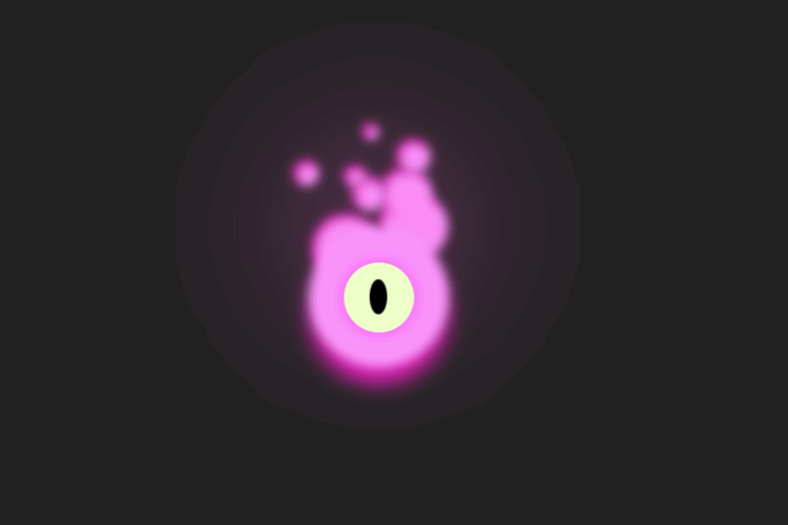
演示效果

HTML&CSS
html>
html lang="en">

head>
    meta charset="UTF-8">
    meta name="viewport" content="width=device-width, initial-scale=1.0">
    title>公众号关注:前端Hardytitle>
    style>
        body {
            margin: 0;
            padding: 0;
            background: #e8e8e8;
            display: flex;
            align-items: center;
            justify-content: center;
            height: 100vh;
        }

        .content {
            width: 50vmin;
            height: 50vmin;
            background: #fff0;
            display: flex;
            align-items: center;
            justify-content: center;
        }

        .pill {
            background: #fff0;
            width: 15vmin;
            height: 40vmin;
            display: flex;
            align-items: center;
            justify-content: center;
            flex-direction: column;
            transform: rotate(180deg);
            animation: spin 4s linear 0s infinite;
        }

        @keyframes spin {
            100% {
                transform: rotate(-540deg);
            }
        }

        .pill.side {
            background: #f7c340;
            position: relative;
            overflow: hidden;
            width: 11vmin;
            height: 15vmin;
            border-radius: 6vmin6vmin00;
        }

        .pill.side+.side {
            background: #d9680c;
            border-radius: 006vmin6vmin;
            border-top: 1vmin solid #621e1a;
            animation: open 2s ease-in-out 0s infinite;
        }

        @keyframes open {

            0%,
            20%,
            80%,
            100% {
                margin-top: 0;
            }

            30%,
            70% {
                margin-top: 10vmin;
            }
        }

        .pill.side:before {
            content: "";
            position: absolute;
            width: 2vmin;
            height: 10vmin;
            bottom: 0;
            right: 1.5vmin;
            background: #fff2;
            border-radius: 1vmin1vmin00;
            animation: shine 1s ease-out -1s infinite alternate-reverse;
        }

        .pill.side+.side:before {
            bottom: inherit;
            top: 0;
            border-radius: 001vmin1vmin;
        }

        .pill.side:after {
            content: "";
            position: absolute;
            width: 100%;
            height: 100%;
            bottom: 0;
            left: 0;
            border-radius: 6vmin6vmin00;
            border: 1.75vmin solid #00000022;
            border-bottom-color: #fff0;
            border-bottom-width: 0vmin;
            border-top-width: 1vmin;
            animation: shadow 1s ease -1s infinite alternate-reverse;
        }

        .pill.side+.side:after {
            bottom: inherit;
            top: 0;
            border-radius: 006vmin6vmin;
            border-top-color: #fff0;
            border-top-width: 0vmin;
            border-bottom-width: 1vmin;
        }

        @keyframes shine {

            0%,
            46% {
                right: 1.5vmin;
            }

            54%,
            100% {
                right: 7.5vmin;
            }
        }

        @keyframes shadow {

            0%,
            49.999% {
                transform: rotateY(0deg);
                left: 0;
            }

            50%,
            100% {
                transform: rotateY(180deg);
                left: -3vmin;
            }
        }

        .medicine {
            position: absolute;
            width: calc(100% - 6vmin);
            height: calc(100% - 12vmin);
            background: #fff0;
            border-radius: 5vmin;
            display: flex;
            align-items: center;
            justify-content: center;
            flex-wrap: wrap;
        }

        .medicinei {
            width: 1vmin;
            height: 1vmin;
            background: #47c;
            border-radius: 100%;
            position: absolute;
            animation: medicine-dust 1.75s ease 0s infinite alternate;
        }

        .medicinei:nth-child(2n + 2) {
            width: 1.5vmin;
            height: 1.5vmin;
            margin-top: -5vmin;
            margin-right: -5vmin;
            animation-delay: -0.2s;
        }

        .medicinei:nth-child(3n + 3) {
            width: 2vmin;
            height: 2vmin;
            margin-top: 4vmin;
            margin-right: 3vmin;
            animation-delay: -0.33s;
        }

        .medicinei:nth-child(4) {
            margin-top: -5vmin;
            margin-right: 4vmin;
            animation-delay: -0.4s;
        }

        .medicinei:nth-child(5) {
            margin-top: 5vmin;
            margin-right: -4vmin;
            animation-delay: -0.5s;
        }

        .medicinei:nth-child(6) {
            margin-top: 0vmin;
            margin-right: -3.5vmin;
            animation-delay: -0.66s;
        }

        .medicinei:nth-child(7) {
            margin-top: -1vmin;
            margin-right: 7vmin;
            animation-delay: -0.7s;
        }

        .medicinei:nth-child(8) {
            margin-top: 6vmin;
            margin-right: -1vmin;
            animation-delay: -0.8s;
        }

        .medicinei:nth-child(9) {
            margin-top: 4vmin;
            margin-right: -7vmin;
            animation-delay: -0.99s;
        }

        .medicinei:nth-child(10) {
            margin-top: -6vmin;
            margin-right: 0vmin;
            animation-delay: -1.11s;
        }

        .medicinei:nth-child(1n + 10) {
            width: 0.6vmin;
            height: 0.6vmin;
        }

        .medicinei:nth-child(11) {
            margin-top: 6vmin;
            margin-right: 6vmin;
            animation-delay: -1.125s;
        }

        .medicinei:nth-child(12) {
            margin-top: -7vmin;
            margin-right: -7vmin;
            animation-delay: -1.275s;
        }

        .medicinei:nth-child(13) {
            margin-top: -1vmin;
            margin-right: 3vmin;
            animation-delay: -1.33s;
        }

        .medicinei:nth-child(14) {
            margin-top: -3vmin;
            margin-right: -1vmin;
            animation-delay: -1.4s;
        }

        .medicinei:nth-child(15) {
            margin-top: -1vmin;
            margin-right: -7vmin;
            animation-delay: -1.55s;
        }

        @keyframes medicine-dust {

            0%,
            100% {
                transform: translate3d(0vmin, 0vmin, -0.1vmin);
            }

            25% {
                transform: translate3d(0.25vmin, 5vmin, 0vmin);
            }

            75% {
                transform: translate3d(-0.1vmin, -4vmin, 0.25vmin);
            }
        }
    style>
head>

body>
    div class="content">
        div class="pill">
            div class="medicine">
                i>i>i>i>i>i>i>i>i>i>i>i>i>i>i>i>i>i>i>i>i>i>i>i>i>i>i>i>i>i>i>i>i>i>i>i>i>i>i>i>
            div>
            div class="side">div>
            div class="side">div>
        div>
    div>

body>

html>
HTML 结构
-
content:整个动画的容器,用于居中显示动画内容。 -
pill:药丸形状的动画主体,包含两个侧面.side和内部的药丸内容.medicine。 -
medicine:药丸内部的动画内容,包含多个小圆点i,用于模拟药丸的动态效果。 -
side:药丸的两个侧面,分别表示药丸的上下部分。
CSS 样式
-
body:设置页面背景颜色、布局方式(居中对齐)和全屏高度。 -
.content:定义动画内容的容器,设置宽高和居中对齐。 -
.pill:定义药丸的主体样式,包括宽高、旋转动画(spin)和布局方式。 -
.pill .side:定义药丸侧面的样式,包括背景颜色、圆角和边框。 -
.pill .side+.side:定义药丸下侧面的样式,包括动画(open)和边框。 -
.pill .side:before 和 .pill .side:after:为药丸侧面添加高光和阴影效果,通过动画(shine 和 shadow)实现动态变化。 -
.medicine:定义药丸内部的样式,包括宽高、圆角和布局方式。 -
.medicine i:定义药丸内部的小圆点样式,通过动画(medicine-dust)实现动态移动效果。 -
@keyframes spin:定义药丸的旋转动画。 -
@keyframes open:定义药丸下侧面的展开动画。 -
@keyframes shine 和 @keyframes shadow:定义药丸侧面的高光和阴影动画。 -
@keyframes medicine-dust:定义药丸内部小圆点的动态移动动画。
各位互联网搭子,要是这篇文章成功引起了你的注意,别犹豫,关注、点赞、评论、分享走一波,让我们把这份默契延续下去,一起在知识的海洋里乘风破浪!

