
这段代码实现了一个具有动态悬停效果的卡片界面,适合用于展示人物信息、产品介绍或其他内容。卡片的交互性和视觉效果使其更具吸引力和用户友好性。
大家复制代码时,可能会因格式转换出现错乱,导致样式失效。建议先少量复制代码进行测试,若未能解决问题,私信我,我会发送完整的压缩包给你。
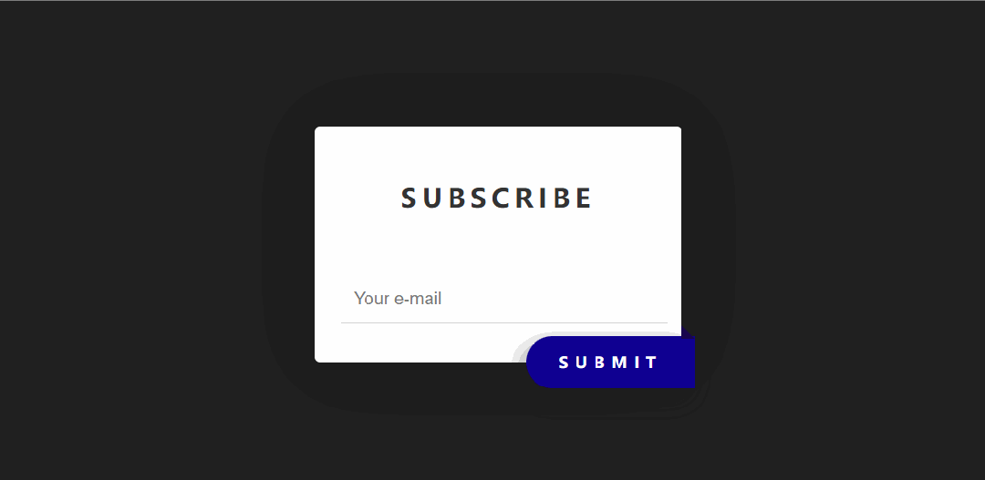
演示效果

HTML&CSS
html>
html lang="en">

head>
    meta charset="UTF-8">
    meta name="viewport" content="width=device-width, initial-scale=1.0">
    title>公众号关注:前端Hardytitle>
    style>
        body {
            margin: 0;
            padding: 0;
            background: #212121;
            display: flex;
            align-items: center;
            justify-content: center;
            height: 100vh;
        }

        .card {
            width: 300px;
            height: 250px;
            display: flex;
            flex-direction: column;
            align-items: center;
            justify-content: center;
            text-align: center;
            gap: 10px;
            background-color: #fffffe;
            border-radius: 15px;
            position: relative;
            overflow: hidden;
            transition: all 0.5s ease;
        }

        .card::before {
            content: "";
            width: 300px;
            height: 100px;
            position: absolute;
            top: 0;
            border-top-left-radius: 15px;
            border-top-right-radius: 15px;
            border-bottom: 3px solid #fefefe;
            background: linear-gradient(40deg, rgba(131, 58, 180, 1) 0%, rgba(253, 29, 29, 1) 50%, rgba(252, 176, 69, 1) 100%);
            transition: all 0.3s ease;
        }

        .card * {
            z-index: 1;
        }

        .image {
            width: 80px;
            height: 80px;
            background-color: #1468BF;
            border-radius: 50%;
            border: 4px solid #fefefe;
            transition: all 0.5s ease;
        }

        .card-info {
            display: flex;
            flex-direction: column;
            align-items: center;
            gap: 15px;
            transition: all 0.5s ease;
        }

        .card-infospan {
            font-weight: 600;
            font-size: 24px;
            color: #161A42;
            margin-top: 15px;
            line-height: 5px;
        }

        .card-infop {
            color: rgba(0, 0, 0, 0.5);
        }

        .button {
            text-decoration: none;
            background-color: #1468BF;
            color: white;
            padding: 4px16px;
            border-radius: 5px;
            border: 1px solid white;
            transition: all 0.5s ease;
            font-size: 14px;
        }

        .card:hover {
            width: 250px;
            border-radius: 250px;
        }

        .card:hover::before {
            width: 250px;
            height: 250px;
            border-radius: 50%;
            border-bottom: none;
            transform: scale(0.95);
        }

        .card:hover.card-info {
            transform: translate(0%, -15%);
        }

        .button:hover {
            background-color: #FF6844;
            transform: scale(1.04);
        }
    style>
head>

body>
    div class="card">
        img class="image" src="https://q0.itc.cn/q_70/images01/20241113/3396209866c743f7af0688eed32999e9.jpeg" alt="">
        div class="card-info">
            span>勒布朗.詹姆斯span>
            p>NBA得分王p>
        div>
        a class="button" href="#">更多a>
    div>

body>

html>
HTML 结构
-
card:卡片的容器,包含整个卡片的内容。 -
image:卡片中的圆形头像图片。 -
card-info:卡片中的信息区域,包含标题和描述。 -
span:卡片标题,显示“勒布朗·詹姆斯”。 -
p:卡片描述,显示“NBA得分王”。 -
button:卡片中的按钮,链接到其他页面,显示“更多”。
CSS 样式
-
.card:定义卡片的样式,包括大小、背景颜色、圆角、过渡动画和布局方式。 -
.card::before:卡片顶部的渐变装饰层,具有动画效果。 -
.image:定义头像图片的样式,包括大小、背景颜色、边框和圆角。 -
.card-info:定义卡片信息区域的样式,包括布局方式和间距。 -
.card-info span:定义卡片标题的样式,包括字体大小、颜色和间距。 -
.card-info p:定义卡片描述的样式,包括字体颜色。 -
.button:定义按钮的样式,包括背景颜色、边框、圆角和悬停效果。 -
.card:hover:鼠标悬停时,卡片变为圆形,大小和形状发生变化。 -
.card:hover::before:鼠标悬停时,卡片顶部装饰层的大小和形状发生变化。 -
.card:hover .card-info:鼠标悬停时,卡片信息区域向上移动。 -
.button:hover:鼠标悬停时,按钮颜色变化并轻微放大。
各位互联网搭子,要是这篇文章成功引起了你的注意,别犹豫,关注、点赞、评论、分享走一波,让我们把这份默契延续下去,一起在知识的海洋里乘风破浪!
